Speaker 1:
Hello, and thank you for joining me for the OnBase Image Form Demonstration. In order to access the OnBase Image Form Designer, you would need to log into the OnBase Unity Client. So, let’s go ahead and log into the OnBase Unity Client using the manager username and the password for the manager account. Once you log in, you should be taken to your home screen. For Designer, we’re going to go to File, Administration and Form Designer. From there, we can open an existing template, or we can create a new template. So today, we’re going to go ahead and create a new template. We have an option of creating a Unity Form or an Image Form, so we will select Image Form. We can filter by our document type group. So, I’m going to go ahead and select Human Resources with a document type of Wage Notification Form (image form).
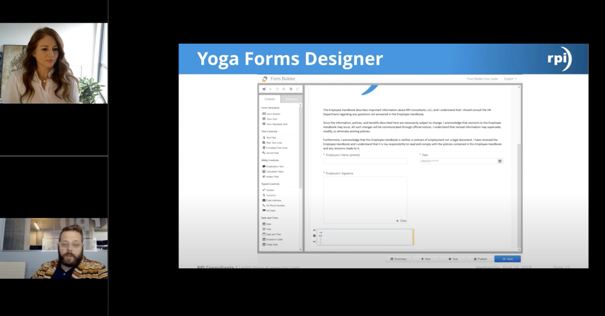
And then I can go ahead and provide the template name. So, let’s maybe name it, just Wage Notification, and then we can go ahead and select Okay. You’ll notice we have just a blank screen here so the first thing we need to do is select our background image for our Image Form. So, we would go to the pencil over here on the left-hand side to find the image that we’ve already uploaded into our client. I’m going to select the pencil to get my options of images I want to use. I can scroll through the list of any images I already have, or I can type in a particular image if I remember what I called it. So, I’m going to look for the NY Pay Change.
There is a preview window on the right-hand side of the screen so that’s the form I want to use. I do have options at the tap to Zoom In, Zoom Out, Cancel Refresh. If I didn’t import a document prior to creating the image form, I could go ahead and do that now, or I can just select Flat, so that way I can start actually building this form. So, you’ll notice on this form, there are some fields for Name, Phone, things like that, so we can add text boxes to those. There are some check boxes, but of course Image Form does not understand that these are real check boxes that can be checked. There’s an area for signatures. So, let’s go ahead and start with our text box first. And we’re just going to do phone number because it’s easy. So, I’m going to drag my text box to the phone area.
I can make my box larger by using the mouse. I have all my design options still on the left-hand side, so I can rename my…sorry, one second. Let me click on that. There we go. I can rename my text box ID or my label. I would recommend doing both so that way, when you’re creating any reports or custom actions, you know exactly what fields you’re adjusting. I always also recommend making the first letter of each word capitalized because it’s just easier, especially in the ID box where you cannot use any spaces. Just think it makes a little bit easier to read, and then you can always remove the number at the end of the ID because that’s not necessarily something you need, but I definitely do recommend renaming the ID field to anything you’d like.
I particularly like to keep the control names of the text box and just add something in the beginning of it. For the mailing address, I can use a multiline text box because we know addresses can be pretty lengthy. There’s not a lot of room on this form, but we need users to be able to add multiple lines and maybe not just one line. So again, I moved my multiline text box into my employer information. I’m going to update the ID field. I can update the label field if I want. (silence)
So, let’s move on now to our check boxes on the form. Like I said, the Image Form does not know that these are check boxes today. So, let’s go ahead and add check boxes over the check box that’s already on the form. So, I’m going to add a check box to my Notice Given. We really probably want to tweak where these check boxes are at so that we don’t see a box over a box, but just for this purpose, we’re just going to kind of leave them where they’re at for right now.
So, we have two boxes for our Notice Given, and let’s go ahead and test drive what we’ve done so far. Oh, you’ll notice I can’t test drive because I get an error message. So, let’s go ahead and open that error message one more time. Sorry about that. It said that, “The form does not contain a submit button.” Let’s go ahead and add a Submit button. So, you’ll notice that the Submit button did not automatically populate on this image form because it didn’t know where to add the Submit button. So, I’m going to add it on the right-hand side of the form and let’s retry this test drive.
Perfect. So now I have my mailing address, multitext box. I have my phone and they have my check boxes next to Notice Given. I cannot do anything else on this form because I did not draw any of the controls over anything else. And again, like I said, you’ll notice that there’s an overlay of boxes because I did not actually line up the boxes correctly. So, in our mailing address, I can type in anything I want. You’ll notice when I hit Enter, it goes to the next line. I can scroll up to see my lines. So, you know that there are multiple lines on this text box. So that looks great. If you want to play around with it, like I said, you can use your mouse to make the check boxes a different size. Maybe move them around a little bit. Of course, might be a little bit of a tedious activity.
You can also make this form a little bit larger, which might be a little bit easier to see where your boxes are at. We can go ahead and add a signature. You’ll see this form is asking for the employee signature. So, we can definitely add a signature box on this form, which is always a great idea. The signature box is of course taking up more room than we want just like the check boxes did. This is a lot of configuration on this end, so how can we go ahead and change this box? We can use our arrows. We can make our image a little bit larger or smaller. You’ll notice when we’re doing that, that some of our other boxes again move, so we definitely want to change those. Or we can go ahead to the left-hand side where our properties are at. We should probably update our ID while we’re over here.
And then we could change the height, width, top, left, right. We can change all our values over here on the side. So, this is also a nice way to do it for the signature boxes. Any values we want, it’s probably going to be a little bit more of a guessing game for people just kind of changing it, going back and forth to see where it ends up going once we change it, but now you’ll notice my box is a lot smaller. So again, with the Unity Forums, it is just a lot of configuring where everything should be and the size of it. But just like on our Unity Forms, we can add a text box anywhere we want on this document. So, I’m going to go ahead and add it now to the Employee’s Rate of Pay.
So now we have check boxes, we have text boxes, we have multiline text boxes. The form’s really starting to come together, but because there’s so many options on this form, we’re not going to go through all of them today in this demonstration. I just wanted to show you how easy it is to build one of these Unity Forms. So, let’s look at one now that’s already been built. So, I’m going to go ahead and just close out of this. I’m going to act like I’m now an individual going in to complete a new form.
So just like on our Unity Forms, I need to go to the top. I need to select Create Forms and I need to find a Unity Form…oh I’m sorry, I need to find an Image Form in this list. So, it’s a really good idea when you’re creating these forms to put some type of indication on them, what one’s an Image Form and what one’s a Unity Form.
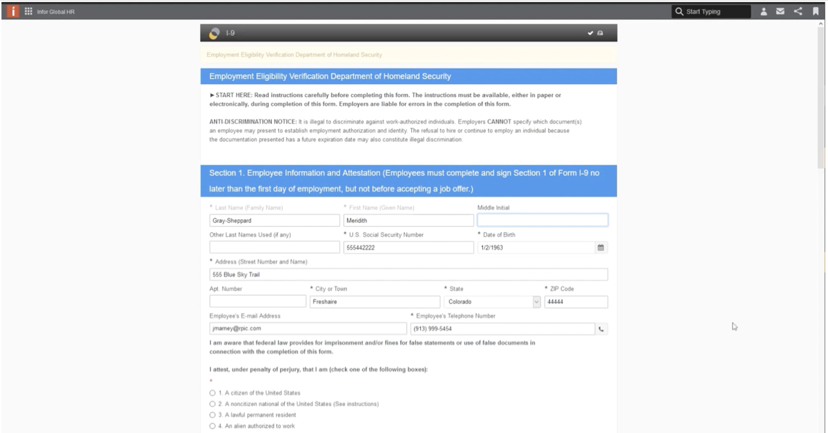
So, let’s go ahead and select our Image Form. And this form, I actually did a while ago, which is why it looks a lot prettier than the demonstration I did a few minutes ago. But you’ll notice here, we have a select list for our employer name, so we can select 9 Second Foods. Once we did that, we have an autofill keyword set up for it, so it’s filled in all our information for that vendor or for that employee or employer.
So that’s less typing I have to do, less mistakes, looks a lot better. We can then go ahead and use our check boxes. We set up custom actions behind the scene, so that way we can only check one of the check boxes for this option here. In this scenario, you really are going to probably have to use check boxes instead of the radio buttons, because the form already has check boxes on them. We have the Employer Rate again, which is just a normal text box. You have the Allowances Taken so we can select anything. Let’s just do None for right now. Is the pay Weekly, Bi-weekly, Other? We can select anything in that check box.
Then let’s go ahead and sign the document, which I’m just going to use the mouse because I don’t have a signature pad. So, my signature is not going to look very good, so I apologize for that. Very large E there I just created. And let’s go ahead and apply the signature. And then you’ll notice on the form because I opened the form today, on April 1st that is the date that automatically have populated in the date section. And then, because I’m logged into OnBase as a manager, the preparer’s name shows up as manager. In OnBase, if I had a title associated with my name, that would show up as well, but the manager account does not. So, if everything is filled out on this form, I can go ahead and submit the form or I can keep adding additional information to the form, but it looks like everything’s filled out so I’m going to submit the form.
And it is not filled out. I actually have a primary language at the Required text box. So, you can still use required fields on this form. So, I typed in English. Now I can submit the form and it’s saved successfully. I’m not going to create any new forms. I know that was a lot to go through in a pretty short time, but Image Forms is really just a way to add the controls of a form onto an image of a document. So hopefully this was helpful. And I thank everybody for joining. Have a great day.

